I came across this wonderful book by Julien C. Sprott about strange attractors, a book free to download no less! It is a book full of beautiful images. It also has lots of source code to generate the imaages yourself - if you read BASIC, that is. I decided to recreate some good parts with R.
In the book’s second chapter, I learned a neat trick to sift through the huge parameter spaces of these attractors to find beautiful patterns, something I’ve never known how to. I will only skim the details to get us to pretty pixels. If you want more rigor, I can highly recommend reading the book.
Strange Attractors
An image of an Attractor is made by generating a sequence of points from an iterated function (“map”). These points are then plot. I will generate pictures from a “two dimensional quadratic map”, which means that I will run through the functions below with different parameters called a:
\[ x_{n+1} = a_1 + a_2x_n + a_3x_n^2 + a_4x_ny_n + a_5y_n + a_6y_n^2\\ y_{n+1} = a_7 + a_8x_n + a_9x_n^2 + a_{10}x_ny_n + a_{11}y_n + a_{12}y_n^2 \]
To see a first pretty picture, I choose some suitable values for the 12 parameters (more about what suitable means in a bit), generate bunch of steps and plot the results.
library(tidyverse)
theme_set(theme_void() + theme(legend.position = 'none'))

# I will go parallel a little later; set up my computer for this
library(future)
library(furrr)
plan(multiprocess)
My first function, quadratic_2d() takes the 12 parameters as a vector a, and an x/y pair to generate the next one step forward.
quadratic_2d <- function(a, xn, yn) {
  xn1 <- a[1] + a[2]*xn + a[3]*xn*xn + a[ 4]*xn*yn + a[ 5]*yn + a[ 6]*yn*yn
  yn1 <- a[7] + a[8]*xn + a[9]*xn*xn + a[10]*xn*yn + a[11]*yn + a[12]*yn*yn

  c(xn1, yn1)
}
I also need a function to run through these iterations and collect the results, which I’ll call iterate(). In return from iterate(), I get a list of points visited by running through the map for a given number of iterations. I use a parameters to generate the so called Hénon map below.
iterate <- function(step_fn, a, x0, y0, iterations) {
  x <- rep(x0, iterations)
  y <- rep(y0, iterations)

  for(n in 1:(iterations - 1)) {
    xy <- step_fn(a, x[n], y[n])
    x[n+1] <- xy[1]
    y[n+1] <- xy[2]
  }

  tibble(x = x, y = y) %>%
    mutate(n = row_number())
}

henon_a <- c(1, 0, -1.4, 0, 0.3, 0, 0, 1, 0, 0, 0, 0)
iterate(step_fn = quadratic_2d, a = henon_a, x0 = 0, y0 = 0, iterations = 5000) %>%
  ggplot(aes(x, y)) +
    geom_point(size = 0, shape = 20, alpha = 0.2) + # Plot a pixel for each point
    coord_equal()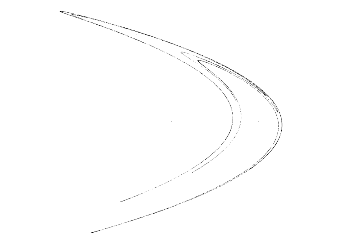
Look at that: a first image appears!
Looking for chaos
Recall that a 2D quadratic map has 12 (!) parameters to pick. Not all parameter sets give interesting results.
Three kinds of plots will appear, depending on which parameters I choose:
- Converging: these are plots which ends up in a fixed point. Nothing much to see here.
- Run-away: Here, the x/y pair runs away to infinity. Again, nothing of interest.
- Chaotic: These are the ones we’re looking for!
Values of a between, say, -1.5 and 1.5 with 0.01 step increments have a reasonable chance of giving chaotic results. This still means that we have 301^12 = 10^70 different charts to sift through. Of these, roughly a single digit percentage are chaotic and interesting. We’d like the computer to do the tedious work of discarding all the boring ones.
This we can teach the computer to do. Think of a chaotic system as having these characteristics:
- Nearby points try to run away from each other, as opposed to settle down. This makes sure the system doesn’t converge.
- Despite trying to run away, the points stay within finite bounds. They turn around instead of shooting of to infinity, making sure the system doesn’t run away.
An algorithm for this is: Follow a point x/y. Before taking each step, place a second point just next to it. Let both points step one iteration forward, and check whether the distance between the two points has increased or decreased. Do this a fair number of times, and check whether the average ratio of the distance after / before is greater than 1. If it is, this means that the points try to increase the distance between them.
To put this into mathematics, let
\[L = \sum log_2 \dfrac{d_{n+1}}{d_n} / N\]
where d is the distance between the two points and N is the number of points evaluated. Since we’re using log:ed values1, the threshold value where looking for becomes L > 0 (2^0 = 1).
Now, if L > 0 and the x/y values are not growing without bound (say, stay within +/- a million), we have a found set of parameters that is chaotic.
Let’s implement a function to calculate L.
L <- function(step_fn, a, x0, y0, iterations = 1000) {
  # Really, put the point nearby and see what happens
  nearby_distance <- 0.000001

  xy <- c(x0, y0)
  xy_near <- xy + c(nearby_distance, 0)

  # Collect the log distance ratios as we iterate
  sum_log_distance_ratios <- 0

  for (n in 1:iterations) {
    xy <- step_fn(a, xy[1], xy[2])
    xy_near <- step_fn(a, xy_near[1], xy_near[2])

    new_distance = sqrt((xy[1] - xy_near[1])^2 + (xy[2] - xy_near[2])^2)

    if (new_distance == 0) {
      # The points have converged
      return (-Inf)
    }

    if (abs(new_distance) == Inf) {
      # The points have run away
      return (Inf)
    }

    # Move near point after xy
    # We put the near point just behind in the direction that they differ
    angle = atan2(xy_near[2] - xy[2], xy_near[1] - xy[1])
    xy_near <- c(xy[1] + nearby_distance * cos(angle),
                 xy[2] + nearby_distance * sin(angle))


    sum_log_distance_ratios = sum_log_distance_ratios + log2(new_distance / nearby_distance)

  }

  sum_log_distance_ratios / iterations
}
Let’s try it on a few sets of parameters. The Hénon map is chaotic, remember?
L(quadratic_2d, henon_a, 0.01, 0.01)## [1] 0.6189951With all zeros, the process settles at (0, 0).
L(quadratic_2d, rep(0, 12), 0.01, 0.01)## [1] -InfGenerating candidates
All moving parts are now in place. I randomize a big bunch of parameter sets, and pick only those who seem chaotic.
set.seed(1)

df <- tibble(pattern = 1:1000) %>%
  mutate(a = map(pattern, ~ round(runif(12, -1.5, 1.5), 2))) %>%
  mutate(L_val = map_dbl(a, ~ L(quadratic_2d, ., 0, 0))) %>%
  filter(L_val > 0)

print(df)
## # A tibble: 17 x 3
## pattern a L_val
## <int> <list> <dbl>
## 1 31 <dbl [12]> 0.257
## 2 75 <dbl [12]> 0.582
## 3 99 <dbl [12]> 0.310
## 4 121 <dbl [12]> 0.00228
## 5 131 <dbl [12]> 0.000268
## 6 164 <dbl [12]> 0.0825
## 7 233 <dbl [12]> 0.00132
## 8 292 <dbl [12]> 0.000865
## 9 423 <dbl [12]> 0.000465
## 10 513 <dbl [12]> 0.113
## 11 529 <dbl [12]> 0.139
## 12 538 <dbl [12]> 0.00472
## 13 683 <dbl [12]> 0.213
## 14 694 <dbl [12]> 0.225
## 15 737 <dbl [12]> 0.583
## 16 743 <dbl [12]> 0.000649
## 17 976 <dbl [12]> 0.164Here, we get 17 candidate parameter sets with an L value > 0. Some of these might run away if we run more iterations, but we’ve eliminated most sets from our bucket list to calculate and inspect.
To use the promising parameters, I walk through them again with more iterations. I also normalize() the x/y points into a range from 0 to 1 to make them plot on the same scales.
normalize_xy <- function(df) {
  range <- with(df, max(max(x) - min(x), max(y) - min(y)))

  df %>%
    mutate(x = (x - min(x)) / range,
           y = (y - min(y)) / range)

}

render_grid <- function(df, iterations) {
  df %>%
    mutate(xy = map(a, ~ iterate(quadratic_2d, ., 0, 0, iterations))) %>%

    # Remove those who have grown very large / might run away
    filter(map_lgl(xy, function(d) with(d, all(abs(x) + abs(y) < 1e7)))) %>%

    mutate(xy = map(xy, normalize_xy)) %>%

    unnest(xy) %>%
    ggplot(aes(x, y)) +
      geom_point(size = 0, shape = 20, alpha = 0.1) +
      coord_equal() +
      facet_wrap(~ pattern)
}

df %>%
  render_grid(5000)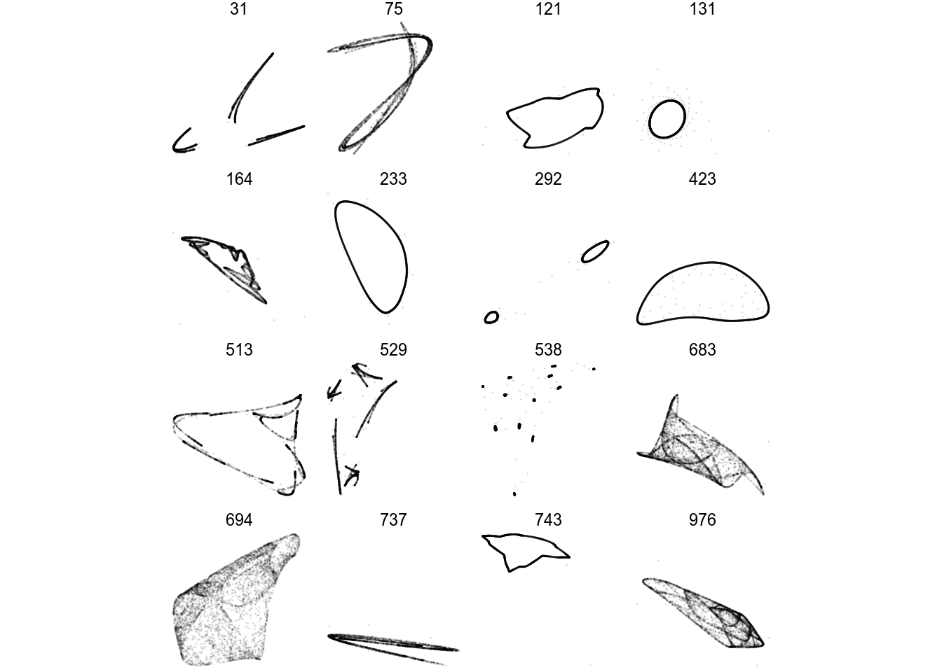
There we go! A few of these look boring and periodic, not really fit for framing. Let’s render one in higher quality anyways:
df %>%
  filter(pattern == 423) %>%
  render_grid(100000)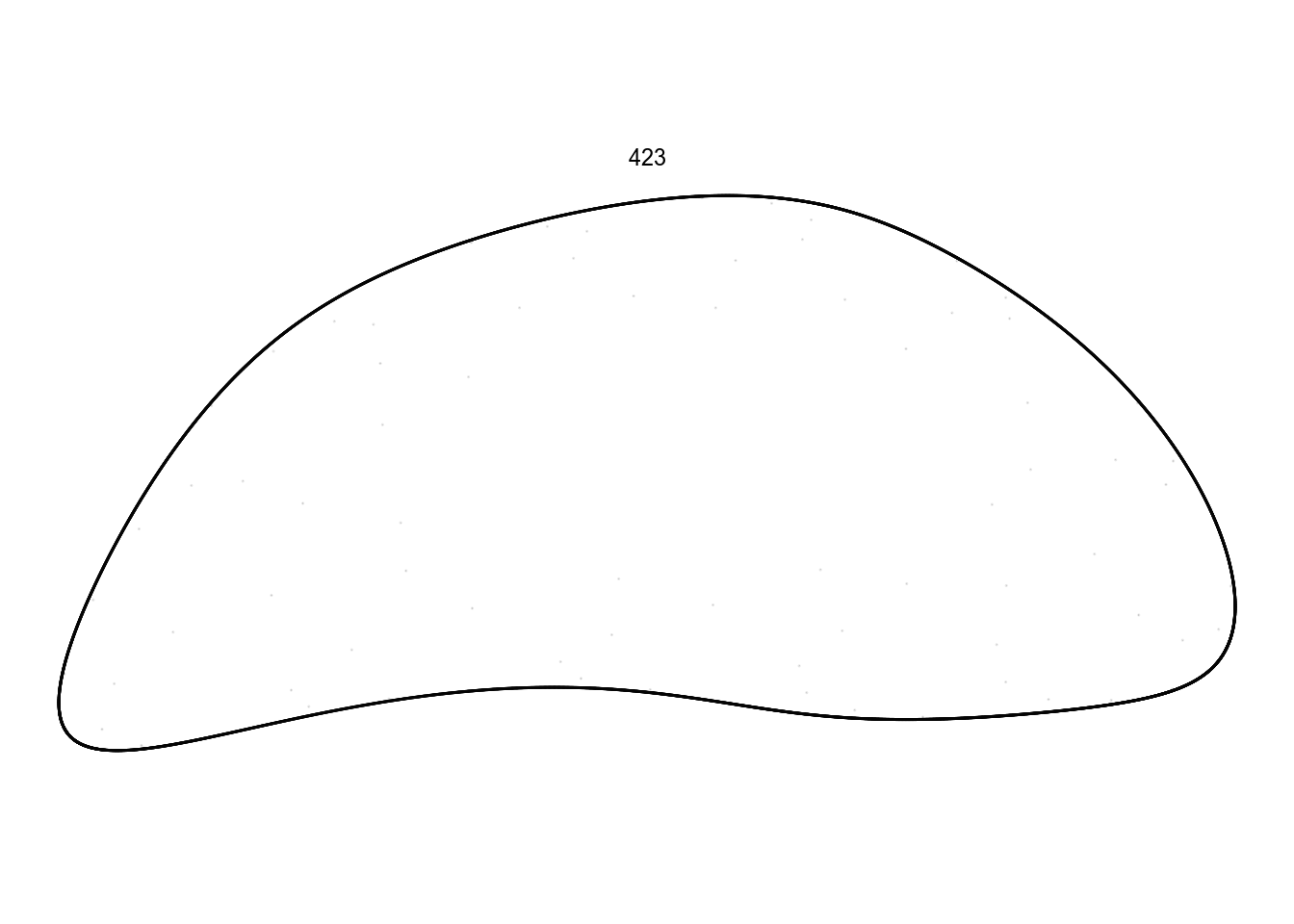
I don’t want to spend spend too much time on these ones. Instead, there are some quite promising in this batch:
df %>%
  filter(pattern == 683) %>%
  render_grid(100000)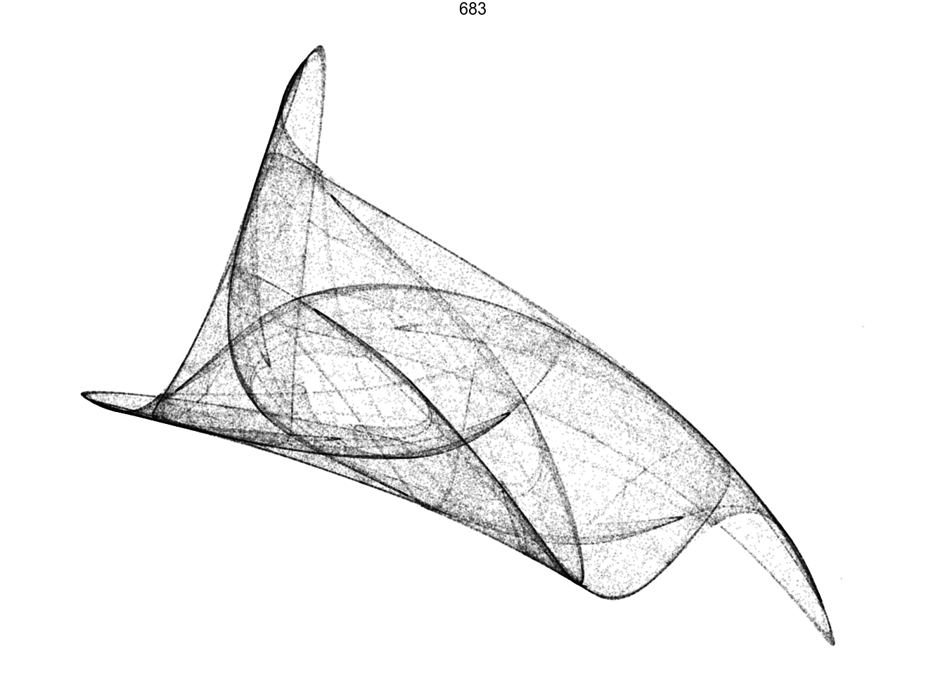
df %>%
  filter(pattern == 694) %>%
  render_grid(100000)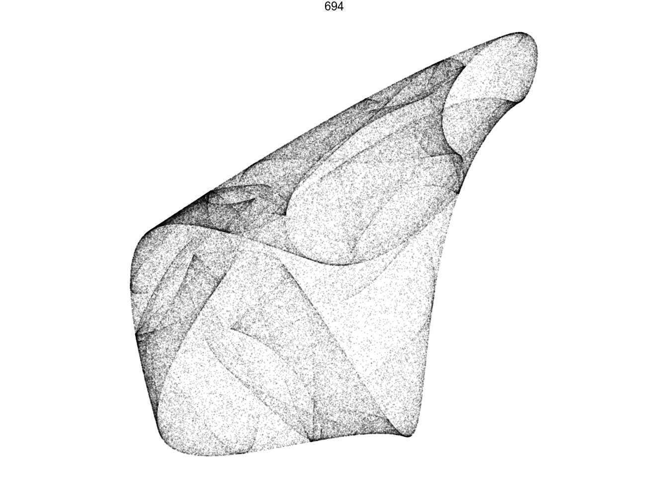
df %>%
  filter(pattern == 75) %>%
  render_grid(100000)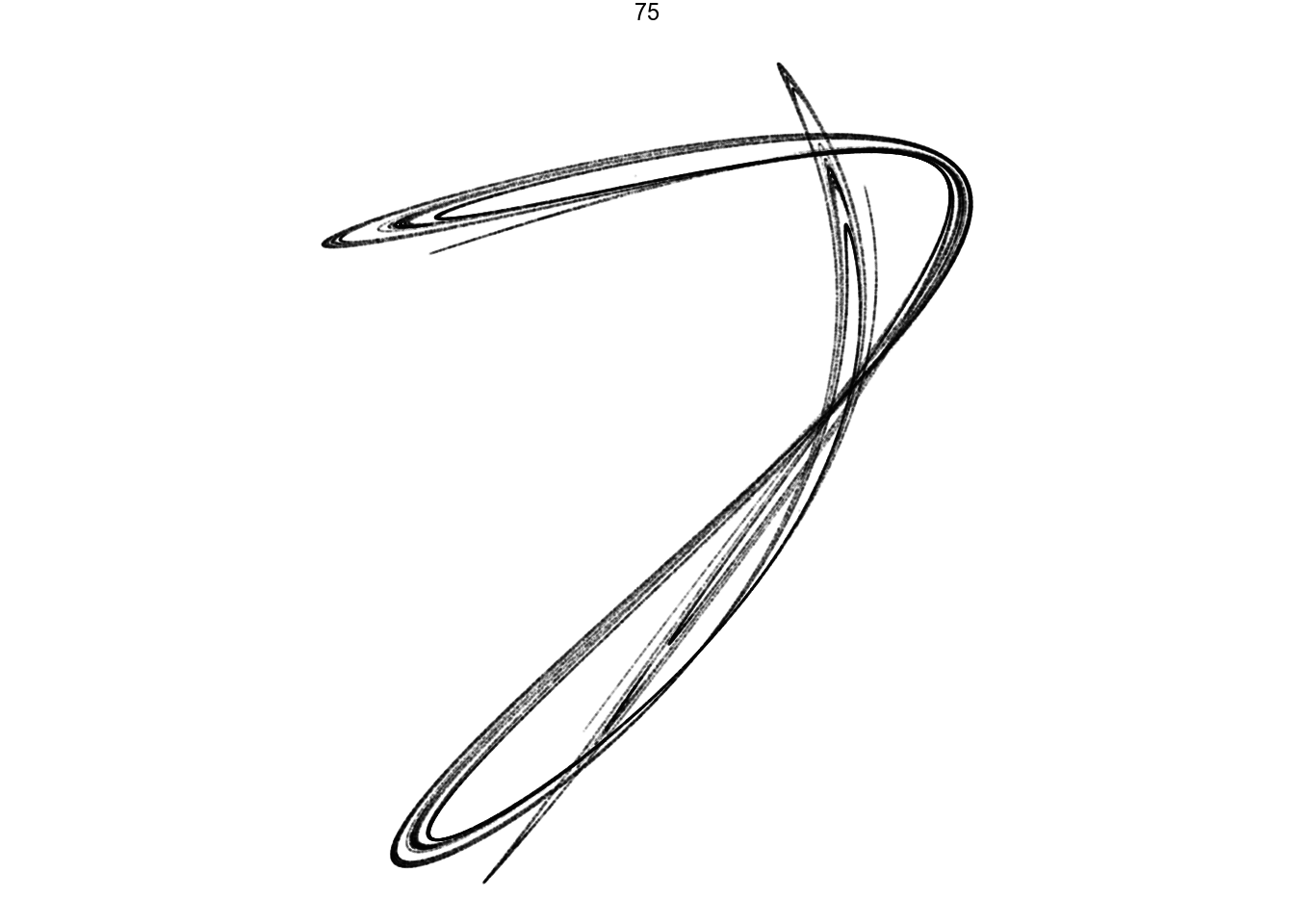
Amazing pictures from such simple math.
Generating print quality
We can tweak the rendering of whatever patterns we find. One trick for this is to not plot each point invididually, but to “bin” them on a grid by counting how many points are in each cell. I can then map this count to color and transparancy values.
To speed things up a little, I’ll parallelize the data generation. I divide the iterations equally among the cores in my CPU. I select slightly different starting points for each thread. This gives eight (or however many cores I happen to have) separate iterations. Since attractors by definition pull points into more visited ruts wherever they start, we won’t notice the eight individual paths we actually walked.
render_print_data <- function(a, iterations, gridsize) {
  CPU_cores <- parallel::detectCores()

  tibble(thread = 1:CPU_cores) %>%
    mutate(x0 = runif(length(thread), -0.1, 0.1),
           y0 = runif(length(thread), -0.1, 0.1)) %>%
    mutate(xy = future_pmap(., function(x0, y0, ...) iterate(quadratic_2d, a, x0, y0, iterations / CPU_cores))) %>%
    unnest(xy) %>%

    # Normalize
    mutate(range = max(max(x) - min(x), max(y) - min(y))) %>%
    mutate(x = (x - min(x)) / range,
           y = (y - min(y)) / range) %>%

    group_by(x = round(x * gridsize) / gridsize,
             y = round(y * gridsize) / gridsize) %>%
    summarize(n = n())
}

df.chosen <- df %>%
  filter(pattern == 694)

d <- render_print_data(df.chosen$a[[1]], 2000000, 1000)

print(head(d))
## # A tibble: 6 x 3
## # Groups: x [1]
## x y n
## <dbl> <dbl> <int>
## 1 0 0.387 7
## 2 0 0.388 5
## 3 0 0.389 10
## 4 0 0.39 10
## 5 0 0.391 8
## 6 0 0.392 16Finally, I style this data with fitting visual choices. I give the image more or less density by transforming the alpha = n variable via for example log, n^0.5, or n^0.3. Trial-and-error seems to be the way to go here.
d %>%
  ggplot(aes(x, y)) +
    geom_point(aes(alpha = sqrt(n), color = log(n)), size = 0, shape = 20) +
    scale_alpha_continuous(range = c(0, 1), limits = c(0, NA)) +
    scale_color_distiller(palette = 'YlOrRd', direction = 1) +
    coord_equal()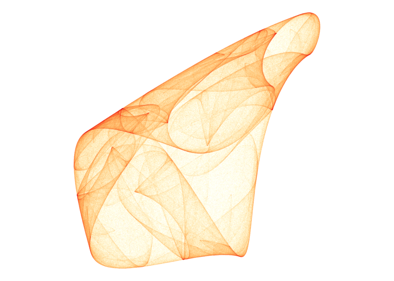
Find something to frame
I can now set out to find many more patterns, and play around with the ones I like. I spent hours in the following process:
- Generate a grid of candidates with 5000 iterations, picking out those that seem promising
- Zoom in on the candidates using 100k iterations
- Take the ones I really like, render with a couple of million points and style until I’m happy.
Here’s a few I liked!
d <- render_print_data(a = c(-0.38, -0.60,  0.20, -0.79,  0.10,  0.54,  0.41, -0.59,  0.95, -1.19, -0.65, -0.66),
                  iterations = 4000000,
                  gridsize = 1000)

d %>%
  ggplot(aes(x, y)) +
    geom_point(aes(alpha = sqrt(n), color = log(n)), size = 0, shape = 20) +
    scale_alpha_continuous(range = c(0, 1), limits = c(0, NA)) +
    scale_color_gradientn(colors = lapply(colourlovers::clpalette(292482)$colors, function(c) paste0('#', c))) +
    coord_equal()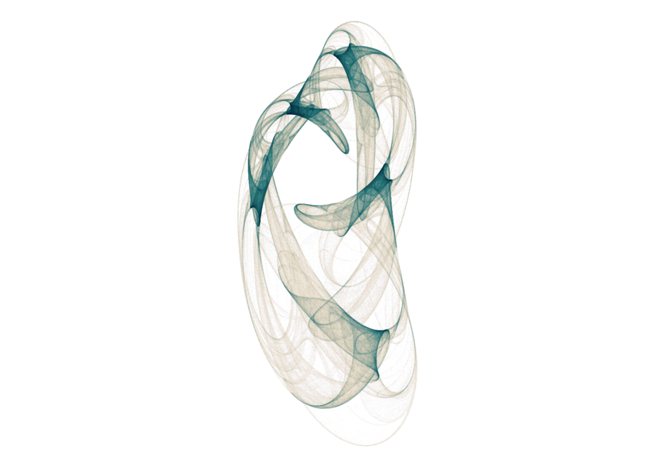
d <- render_print_data(a = c(0.23, -0.15, -0.25, 0.71, 0.79, -0.04, -0.57, 0.91, 0.59, -0.9, -0.58, 1.02),
                  iterations = 4000000,
                  gridsize = 1000)

d %>%
  ggplot(aes(x, y)) +
    geom_point(aes(alpha = n ^ 0.05, color = log(n)), size = 0, shape = 20) +
    scale_alpha_continuous(range = c(0, 1), limits = c(0, NA)) +
    scale_color_gradientn(colors = lapply(colourlovers::clpalette(444487)$colors, function(c) paste0('#', c))) +
    coord_equal()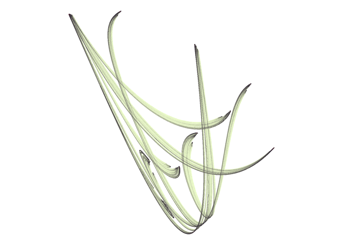
d <- render_print_data(a = c(-0.16, -0.37, -0.27, 0.16, -0.66, -0.74, -1.11, -0.51, 0.59, 0.81, -0.06, -0.44),
                  iterations = 2000000,
                  gridsize = 1000)

d %>%
  ggplot(aes(x, y)) +
    geom_point(aes(alpha = sqrt(n), color = sqrt(n)), size = 0, shape = 20) +
    scale_alpha_continuous(range = c(0, 1), limits = c(0, NA)) +
    scale_color_gradientn(colors = rev(lapply(colourlovers::clpalette(131576)$colors, function(c) paste0('#', c)))) +
    coord_equal()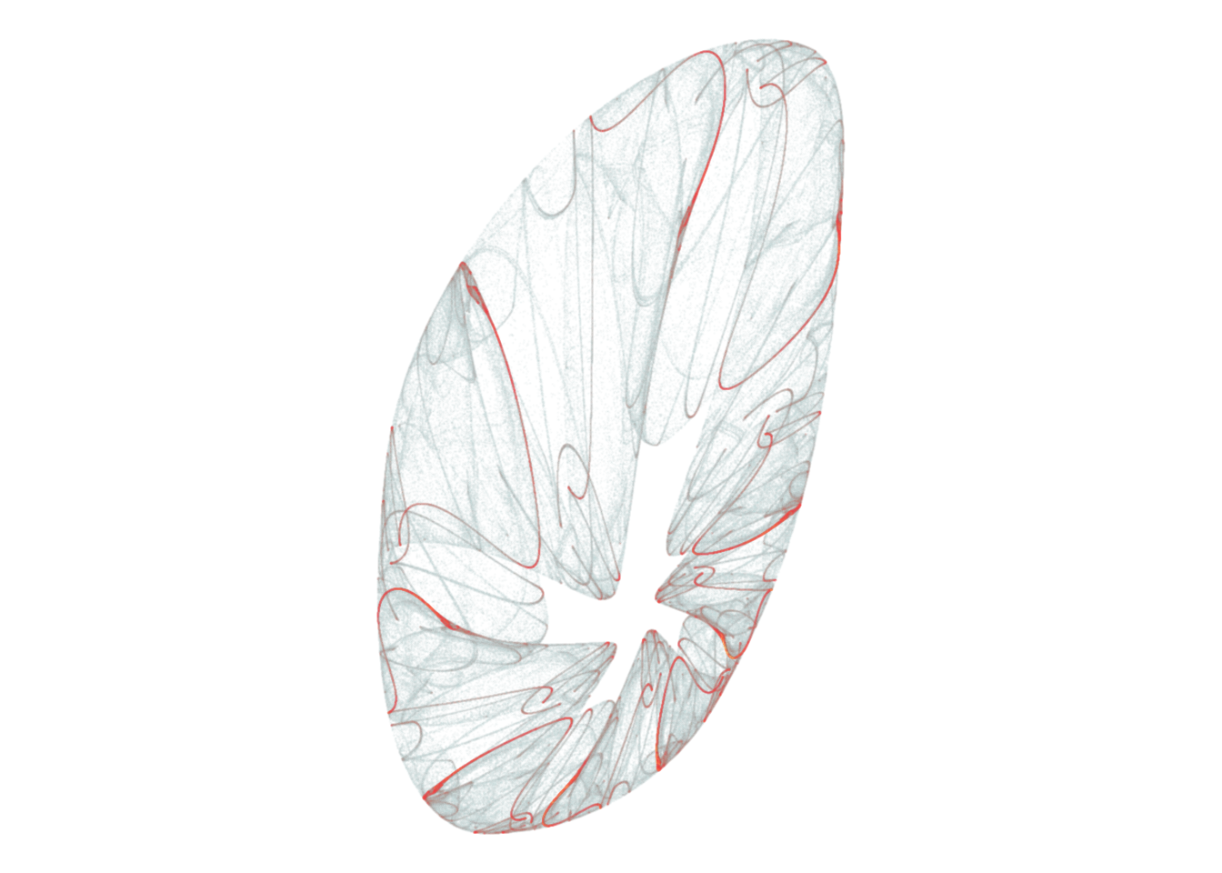
d <- render_print_data(a = c(1.03, -1.11, 0.25, -0.51, 0.6, 0.33, 1.2, 0.28, -0.71, -0.68, -0.66, -0.8),
                  iterations = 2000000,
                  gridsize = 1000)

d %>%
  ggplot(aes(x, y)) +
    geom_point(aes(alpha = n^0.3, color = log(n)), size = 0, shape = 20) +
    scale_alpha_continuous(range = c(0, 1), limits = c(0, NA)) +
    scale_color_gradientn(colors = rev(lapply(colourlovers::clpalette(41095)$colors, function(c) paste0('#', c)))) +
    coord_equal()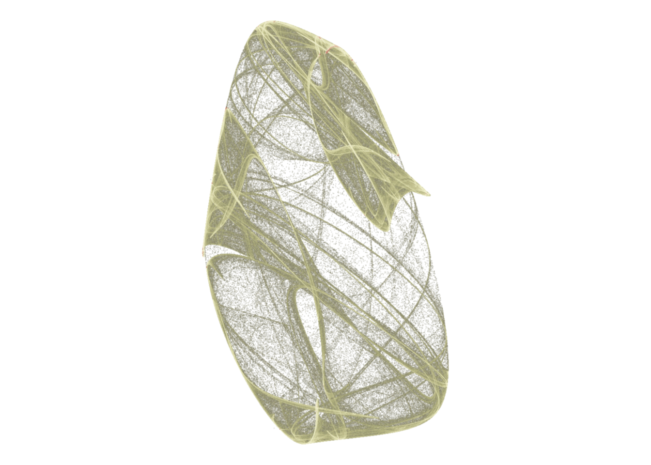
d <- render_print_data(a = c(0.94, -0.68, 0.54, -0.36, 0.42, -0.99, -0.92, -0.26, 0.82, -0.08, -0.48, 0.98),
                  iterations = 2000000,
                  gridsize = 1000)

d %>%
  ggplot(aes(x, y)) +
    geom_point(aes(alpha = n^0.65, color = sqrt(n)), size = 0, shape = 20) +
    scale_alpha_continuous(range = c(0, 1), limits = c(0, NA)) +
    coord_equal()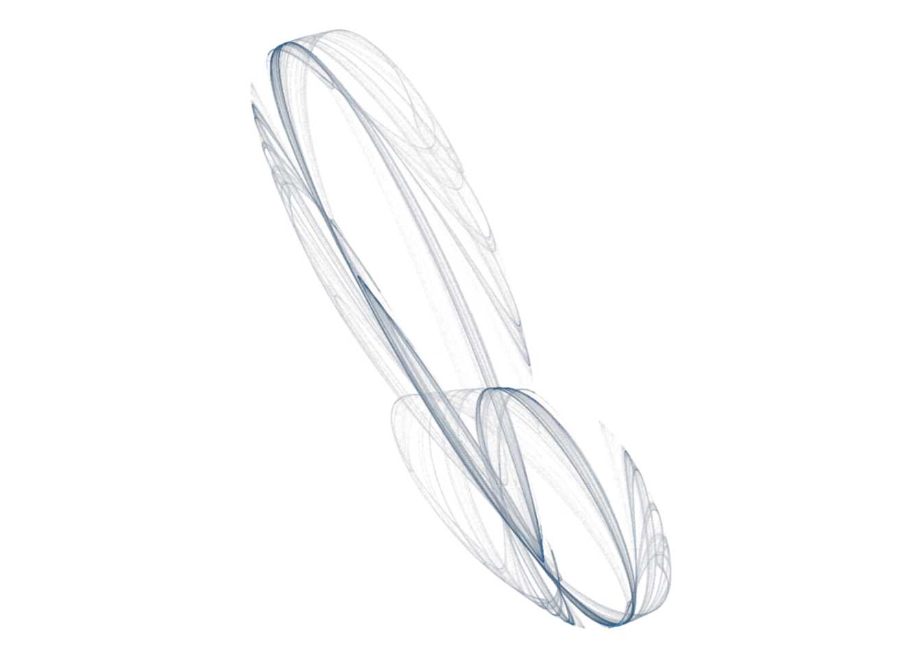
Averaging log values means that we’re calculating the geometrical mean↩